![]()
Icons: tiny little symbols that say so much. They are everywhere these days, and play a massive role in the success of user interfaces (UIs). Whether you’re an aspiring user interface designer or a UX designer looking to brush up on some visual design skills, the icon design process is a crucial one to have in your toolkit.
When it comes to designing a new set of icons from scratch for a new project, it’s essential to allocate enough time to the process. There are also some guidelines to keep in mind which will help to ensure that your icons are recognizable and user-friendly.
In this guide, we’re going to walk through the icon design process step by step. First, I’ll show you seven key considerations to keep in mind when designing icons from scratch. Then we’ll put our theory into practice, designing a camera icon from start to finish.
This post is divided into two sections:
Ready? Let’s dive in!
In this section, we’ll go over seven key considerations to keep in mind as you design icons.
Many things in digital design are governed by a grid. Icons are no different. When designing icons, you’ll want to pay close attention to the pixel grid and how your icon fits into it.
The easiest way to make sure your icons fit snugly into the pixel grid is to stick to whole numbers. Avoid decimal points at all costs—these guys yield blurry edges. Let’s take a look at what this looks like in practice.
Below, I drew a simple house icon and left the pixel grid turned on. On the left, you’ll see an icon made up of strokes that fit perfectly into the pixel grid. On the right, the stroke falls slightly off. You can tell by looking at the lines that make up the pixel grid—they cut right through the stroke.
![]()
Now, let’s look at the diagonals that make up the roof for a sec. These don’t sit perfectly on the grid. We wouldn’t be able to make them fit because the grid is made up of vertical and horizontal lines, no diagonals. In these cases, we make sure the starting and end points that make up the diagonal sit on the grid.
It’s tempting to want to design a brand new, crazy novel icon or set. We’re creatives, after all! However, we’ve got standards we wish to adhere to. We’ve become familiar with specific icons that signify standard functionality.
Consider the little magnifying glass we see everywhere that says “search.” Magnifying glasses aren’t the only item that can say “search.” However, we’ve used them so frequently that they have now become the standard search icon. Using a different icon requires the user to learn something new, slowing them down as a result. This is not so conducive to a smooth user experience!
Before designing your icon, look around to identify any standards you might need to keep in mind as you work. Does this mean there is no room for creative freedom? Fortunately, it doesn’t! If the icon isn’t representing functionality governed by standards, we can let our creative juices flow. If it is, we can still give it a creative twist. As long as the icon and its function is still instantly recognizable, it’s perfectly OK to add your own design flair!
We’re often slapping icons in tiny places, like the tab bar on an iPhone. As things get small, too much detail begins to get lost.
When you design, be strategic about the kinds of detail you choose to include. Go easy on the little parts and make sure your icons read clearly, even at small sizes.
When we design a set of icons, they should feel like a family. They won’t all look the same but will have similar visual attributes, making them feel related.
As you design, make consistent styling choices. If, for example, you’ve used rounded corners and ends in one icon, make sure you do so for all the rest. Styling, sizing, and the level of detail should all be consistent. This contributes to a coherent visual language—a crucial part of branding!
Be careful with little details or elements that sit too close to each other. At a small size, items that are not spaced out carefully can be tough to read and will begin to lose meaning.
The best way to make sure your icons communicate clearly and quickly with users is to test them. Once you’ve finished designing your icons, it’s good practice to run a quick test.
Show your icons to a friend or someone else on your team. Ask them to tell you the first thing that comes to mind when they see them. If it aligns with what you’ve intended to communicate, you’re in good shape!
Everything can be broken down into basic shapes. Remember our house icon above? We designed with two rectangles and a triangle.
Once you’ve defined what your icon will be, try to break it down into simple shapes. This is the best way to begin to construct and simplify your icons.
We’ve gone over what to consider when designing an icon. Now, let’s put it into practice. To do so, we’ll go through the process of building a simple camera icon.
I’ll be using Sketch. However, you can replicate the following steps in other design software, like Figma. If you can’t decide on a tool, check out this comparison of Figma and Sketch.
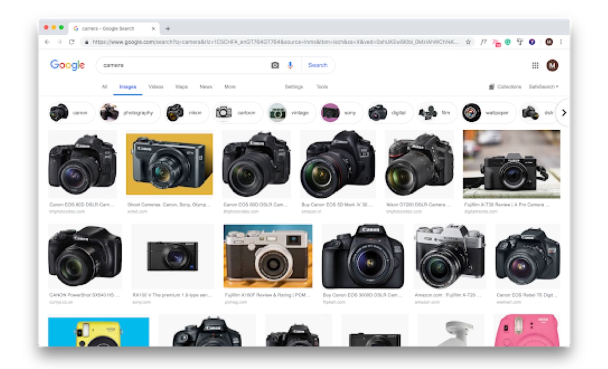
To start, let’s get familiar with what cameras look like. An easy way to do so is to Google what you’re going to design. I Googled “camera” and got the following results:

My results show a variety of cameras, all in different shapes and sizes. However, they have a few common defining characteristics:
We’ll want to make sure to include these three characteristics in our design as they’ll make our camera icon easily recognizable to a broad audience.
Next, we’ll begin to look for basic shapes. Are there any circles, squares or rectangles we can use to build? Go through a few sketches and iterations to help you identify them.
I found the following:
These will be our building blocks.
With all of this information, we’re ready to move to the computer. Start off by creating an artboard that is 24x24px, naming it “Camera Icon,” and turning on the pixel grid. Your workspace should look something like this:

On it, begin to draw the basic shapes that make up the three defining characteristics we identified before. Make sure all the shapes fit snugly on the pixel grid as we did in the example below.
![]()
If your pixels aren’t snapping to the grid, take a look at your border settings. Make sure you’ve got your borders set to the outside or inside of the shape and not center. If you set your border to center, you risk ending up with elements outside of the pixel grid.
Combine any shapes you can using Boolean operations to simplify your work. Say we wanted to add more detail to the lens by adding a larger circle around the small one in the center:we could cut out the larger one from the body of the camera to turn them into one shape.
To make sure our work reads clearly, we’ll want to test it. Share your work with a co-worker or friend. Ask them what they see. Did they instantly recognize your icon as a camera, or are you not quite there?
Before you finalize your icon, double check for any decimal points. Look at the numbers in the inspector and make sure they are all whole.
Save your work and export it to share with the world!
We’ve designed a pretty simple camera icon with minimal details and strokes. You can always increase the complexity of your design and style. However, the process and key things to keep in mind should always be the same.
Happy designing! If you’d like to learn more about user interface design, check out the following articles:
This article is part of:
Writer for The CareerFoundry Blog
Maria de la Riva is a UX/UI Designer and digital nomad. For the past four years, she's worked with online education startups like CareerFoundry, mentoring and writing curriculum content. Currently, she is Head of Product at Iguama Inc., a startup developing the technology loyalty programs need to help their users redeem points on online retailers. Maria is an avid diver and sailor.


CareerFoundry is an online school for people looking to switch to a rewarding career in tech. Select a program, get paired with an expert mentor and tutor, and become a job-ready designer, developer, or analyst from scratch, or your money back.